A lesson for developers
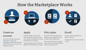
It is pertinent and important, in the midst of the excitement of the new healthcare exchanges and their myriad failures, to understand how those failing online coverage exchanges are also a lesson for developers. Since the exchanges went live with the implementation of the Affordable Care Act on October 1, we’ve been hearing constant reports and complaints about glitches, load failures, and generally poorly-performing functionality from people trying to sign up for health insurance, as well as those trying to help them do it.
The O’Reilly Programming Blog recognized it as an example of what not to do, especially if you are developing a website for a larger organization that will undoubtedly see high traffic once it’s live — not to mention the press constantly reporting on the whole meltdown. James Turner on the O’Reilly Blog focused on four main points, and he hits the nail on the head, and we add our own commentary and perspective.
Lessons
- Load testing is your friend. “It has become abundantly clear that the site was never stress-tested under anything like the type of load it is encountering. Creating realistic load testing of a site as complicated as healthcare.gov isn’t easy, but just having a thousand bots load the home page isn’t going to give you a realistic load test.” Putting people in a queue is not a sufficient answer in the world of flaky consumers shopping for anything online today. If it won’t load, they’ll go elsewhere. In this case, there’s no direct competitor, though it’s been reported that private insurance providers have been getting a whole lot of interest in the wake of site failures.
- Pretty doesn’t trump functional. The behind-the-scenes stuff needs to be incredibly tolerant of failures. That’s not been true thus far. “Nothing drives a user crazy more than having to go through the same form over and over because of failures that leave them high and dry.” We absolutely could not agree more. When’s the last time you hacked out the responses to a web form more than twice before giving up entirely?
- Validation logic needs to actually work. This one is difficult and time-consuming, sure, but it’s so crucial. It goes along with the whole user experience, though the average user won’t understand technically what’s going on at all. They’ll only be, quite simply, totally enraged when they get stuck. Turner’s explanation, verbatim: “One of the more interesting early failures of the site was that the username required numbers, but the instructions made no mention of it (and neither did the failure message). It’s especially easy to get an impedance mismatch when you have both client Javascript and server code trying to do the same validations. Keeping the client code, server code, error messages and instructions in sync can be very difficult, but getting it wrong will lead to enraged users.”
- UX isn’t a luxury. Any significant web platform or marketplace has to have a solid user experience or risk becoming an enormous flop. Even something as immune to the competition of regular markets can become obsolete and see much of its potential diminished. A strong or weak healthcare exchange has the potential to impact the success of the entire machine. And it’s a big machine. Big experiment means great failure or great success.
There will surely be other lessons learned for developers, but also for government officials, economists, insurance providers, and citizens. As a developer yourself, do you see this perspective as helpful? What lessons or takeaways do you see from your vantage point?