Front-end Integration APIs
This list documents the JavaScript APIs used for Front-end Integration.
Note
See front end considerations for common troubleshooting tips for embedding Izenda’s front end.
List of APIs
| Class and Method | Purpose |
|---|---|
| IzendaSynergy | |
| Configure Izenda | |
| Render all Izenda web page inside hosting web | |
| Render Izenda Setting page only inside hosting web | |
| Render Izenda Report page only inside hosting web | |
| Render Izenda Report Designer Page (New/Edit Report) inside hosting web | |
| Render Izenda Report Viewer page only inside hosting web | |
| Render specific Report Part inside hosting web | |
| Render Izenda Dashboard page only inside hosing web | |
| Render Izenda New Dashboard page | |
| Authentication and authorization between hosting web and Izenda. Dictates if the rendered element has to be refreshed or not. | |
| Render Izenda Dashboard Viewer page | |
Register a JsFormatString with format function New in version 2.6.20. |
|
Get the class by name New in version 2.11.0. |
|
Register a visualization engine with a name New in version 2.11.0. |
|
Register property editor with its factory function to create a custom property editor inside Report Designer’s property panel. New in version 2.11.0. |
|
Create a dropdown editor schema in Properties editor panel. This function is used as the factory property value of propertySchema of report part/style configuration. New in version 2.11.0. |
|
Create a popup editor schema in Properties editor panel. It appears as a label and a gear button which opens the popup dialog. This function is used as the factory property value of propertySchema of report part/style configuration. New in version 2.11.0. |
|
Create a checkbox editor schema in Properties editor panel. It appears as a label and a checkbox. This function is used as the factory property value of propertySchema of report part/style configuration. New in version 2.11.0. |
|
Create a select editor schema in Properties editor panel. It appears as a label and select control. This function is used as the factory property value of propertySchema of report part/style configuration. New in version 2.11.0. |
|
Create a number editor schema in Properties editor panel. It appears as a label and number input control. This function is used as the factory property value of propertySchema of report part/style configuration. New in version 2.11.0. |
|
Create a color palette editor schema in Properties editor panel. It appears as a label and color palette input control. This function is used as the factory property value of propertySchema of report part/style configuration. New in version 2.11.0. |
|
Register field container with its factory function in order to create a custom field container in Report Designer’s report part configuration. New in version 2.11.0. |
|
Create a label and a field input box which allows to add/remove or drag/drop a field into. New in version 2.11.0. |
|
Create a static label only without input box. New in version 2.11.0. |
|
Create a conditional label and a input box of fields which allows to add/remove or drag/drop a field into. New in version 2.11.0. |
|
Set configuration of a report part type. New in version 2.11.0. |
|
Get configuration of a report part type. New in version 2.11.0. |
|
Extends report part with a new style configuration. New in version 2.11.0. |
|
Render Izenda Export Manager Page inside hosting web. New in version 3.10.4. |
config(configJson)
Configure Izenda
Parameters
configJson
{
   "WebApiUrl": hostApi,
   "BaseUrl": "/izenda",
   "RootPath": "/Scripts/izenda",
   "CssFile": "izenda-ui.css",
   "Routes": {
     "Settings": "settings",
     "New": "new",
     "Dashboard": "dashboard",
     "Report": "report",
     "ReportViewer": "reportviewer",
     "ReportViewerPopup": "reportviewerpopup",
     "Viewer": "viewer"
   },
   "TimeOut": 3600,
   "UIPreferences": {
         "ReportFilterSectionExpanded": true
     },
   "NeedToEncodeUrl" : true
}
New in version 2.0:
The optional NeedToEncodeUrl parameter (defaults to true if not specified).
Set it to false if host framework expects unencoded urls (such as Angular 2).
Samples
var hostApi = location.protocol + '//' + location.host + "/api/";

var configJson = {
   "WebApiUrl": hostApi,
   "BaseUrl": "/izenda",
   "RootPath": "/Scripts/izenda",
   "CssFile": "izenda-ui.css",
   "Routes": {
     "Settings": "settings",
     "New": "new",
     "Dashboard": "dashboard",
     "Report": "report",
     "ReportViewer": "reportviewer",
     "ReportViewerPopup": "reportviewerpopup",
     "Viewer": "viewer"
   },
   "TimeOut": 3600,
   "UIPreferences": {
     "ReportFilterSectionExpanded": true
   }
};

IzendaSynergy.config(configJson);
New in version 2.10.0.
For version 2.10.0 and later, Izenda provides option to configure dynamic WebApiUrl.
Samplesvar configJson = { "WebApiUrl": () => { const currentHour = new Date().getHours(); return currentHour < 6 || currentHour >= 22 ? 'http://localhost:14809/api/' : 'http://localhost:65469/api'; }, "BaseUrl": "/izenda", "RootPath": "/Scripts/izenda", "CssFile": "izenda-ui.css", "Routes": { "Settings": "settings", "New": "new", "Dashboard": "dashboard", "Report": "report", "ReportViewer": "reportviewer", "ReportViewerPopup": "reportviewerpopup", "Viewer": "viewer" }, "TimeOut": 3600, "UIPreferences": { "ReportFilterSectionExpanded": true }, "NeedToEncodeUrl" : true }; IzendaSynergy.config(configJson);
render(element)
Render all Izenda web page inside hosting web
Parameters
element
Samples
IzendaSynergy.render(document.getElementById('izenda-root'));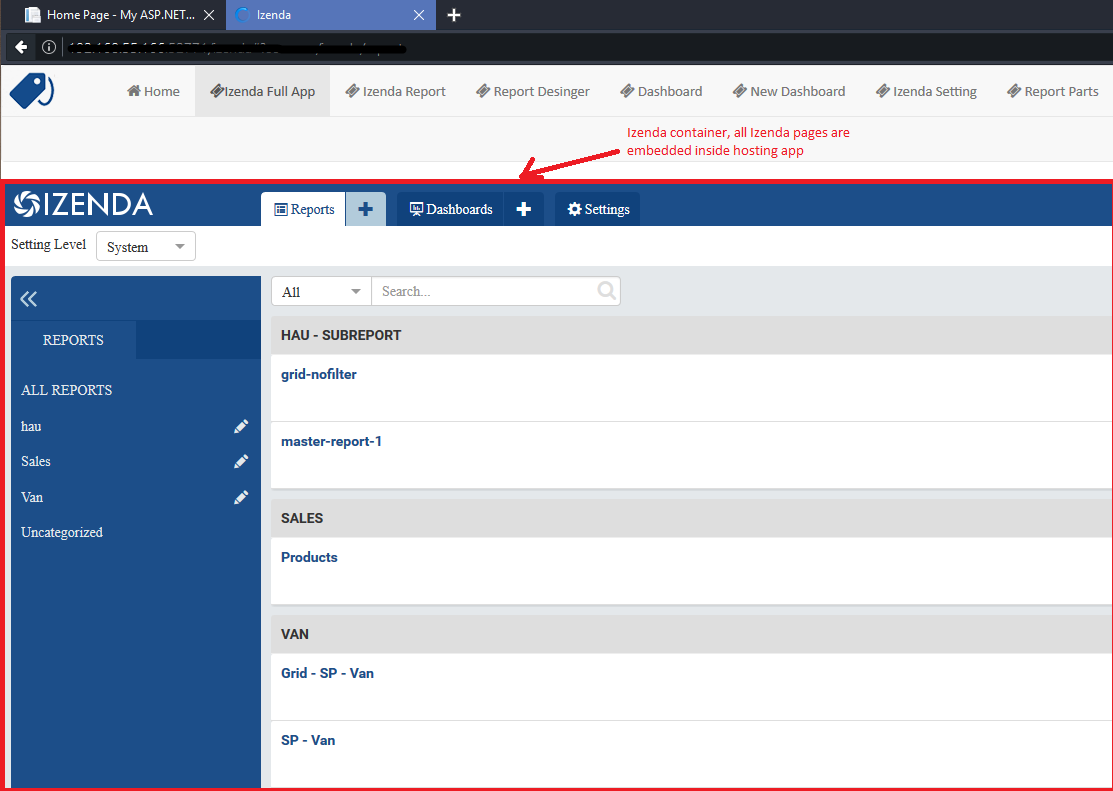
Fig. 422 Izenda Inside
renderSettingPage(element)
Render Izenda Setting page only inside hosting web
Parameters
element
Samples
IzendaSynergy.renderSettingPage(document.getElementById('izenda-root'));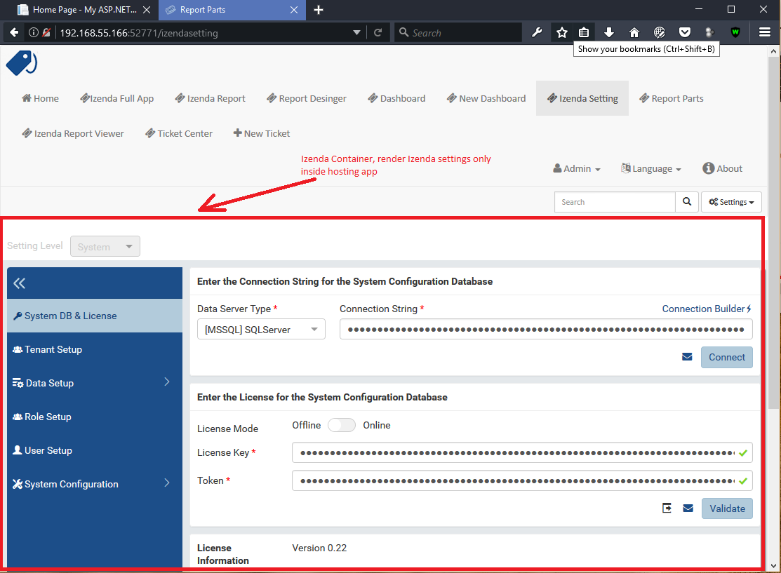
Fig. 423 Izenda Settings
renderReportPage(element)
Render Izenda Report page only inside hosting web
Parameters
element
Samples
IzendaSynergy.renderReportPage(document.getElementById('izenda-root'));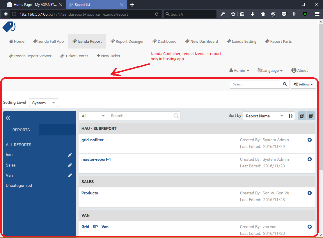
Fig. 424 Izenda Report only
renderReportDesignerPage(element)
Render Izenda Report Designer Page (New/Edit Report) inside hosting web
Parameters
element
Samples
IzendaSynergy.renderReportDesignerPage(document.getElementById('izenda-root'));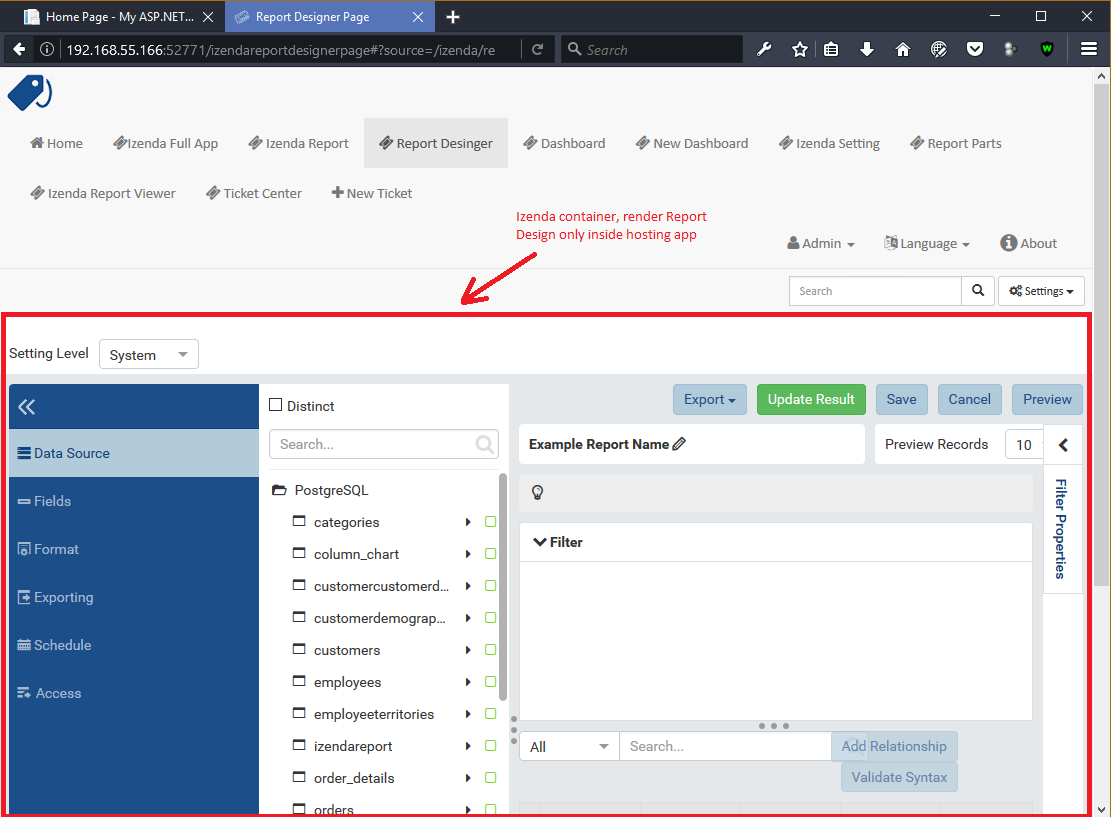
Fig. 425 Izenda Report Designer only
renderReportViewerPage(element,report_id, filter,integrationStyle)
Render Izenda Report Viewer page only inside hosting web
Note
The integrationStyle parameters hideReportName and hidePreviewRecords were made available in v3.1.0.
Parameters
Field Description element
A DOM element to render inElement to render in report_id
String (GUID)The report Id overridingFilterValue
A filter objectThe values for the filters, in this format { p1value: a_value, p2value: another_value, .. }integrationStyle The options for toolbar and filter section, in this format { "hideToolbar": true/false, "hideFilter": true/false, "hideReportName": true/false, "hidePreviewRecords": true/false }
Samples
IzendaSynergy.renderReportViewerPage(document.getElementById('izenda-root'), "C2946606-7159-4FB3-82B7-E7D4ED3162A0",{overridingFilterValue: { p1value: "test123" }},{ "hideFilter" : true});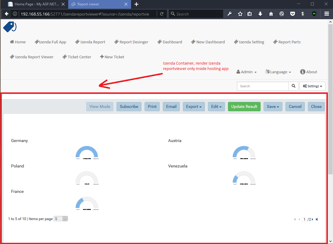
Fig. 426 Izenda Report Viewer Only
renderReportPart(element,params)
Render specific Report Part inside hosting web
Parameters
element : a DOM element
params : an object contains fields below:
Field Description Note id
String (GUID)The report part Id Required filter
An array of Object with key and valueFilters on sub report Optional crosssfilters
An array of Object with key and valueCross filtering’s filter on report Optional overridingFilterValue Override all or specified default fillter values by using pvalue Optional onPublishDrillInfo
A functionThis function which will be invoked when drilldown Optional useQueryParam
A booleanA flag to use parameters specified in a query string of a URL Optional, required for exports useHash
A booleanA flag to use hashing in a URL Optional, required for exports previewRecords
IntegerNew in version 2.15.1.
The number of preview records Optional (The default value is the value saved in the report definition)
Samples
IzendaSynergy.renderReportPart(document.getElementById('izenda-part1'), {
   "id": "804B35C8-44A4-4535-A484-F27E8ABA410D",
   "filters": [
     {
        "key": "[northwind].[dbo].[Order].[ShipCountry]",
        "value": "Australia"
     }
   ],
   "overridingFilterValue": {
      p1value : 10,
    },
   "crosssfilters": [
     {
        key: "[northwind].[dbo].[Order].[ProductID]",
        value: 23
     }
   ],
   onPublishDrillInfo: function (drillInfo) {
         console.log("drillInfo", drillInfo);
     }
});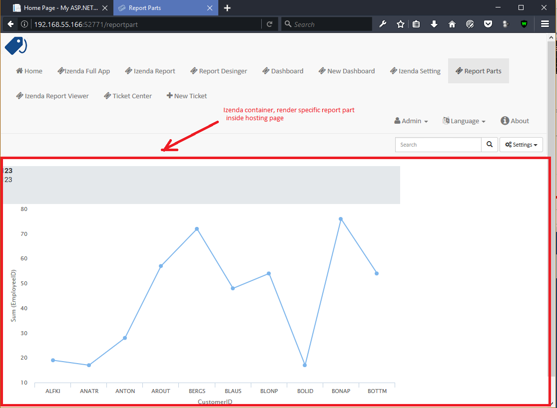
Fig. 427 Izenda Specific Report Part
The following example demonstrates the use of useQueryParam and useHash for exports. The sample is derived from our Sample MVC 5 Application
IzendaSynergy.renderReportPart(document.getElementById('izenda-root'), {
   id: reportPartId,
   useQueryParam: true,
   useHash: false
});
renderDashboardPage(element)
Render Izenda Dashboard page only inside hosing web
Parameters
element
Samples
IzendaSynergy.renderDashboardPage(document.getElementById('izenda-root'));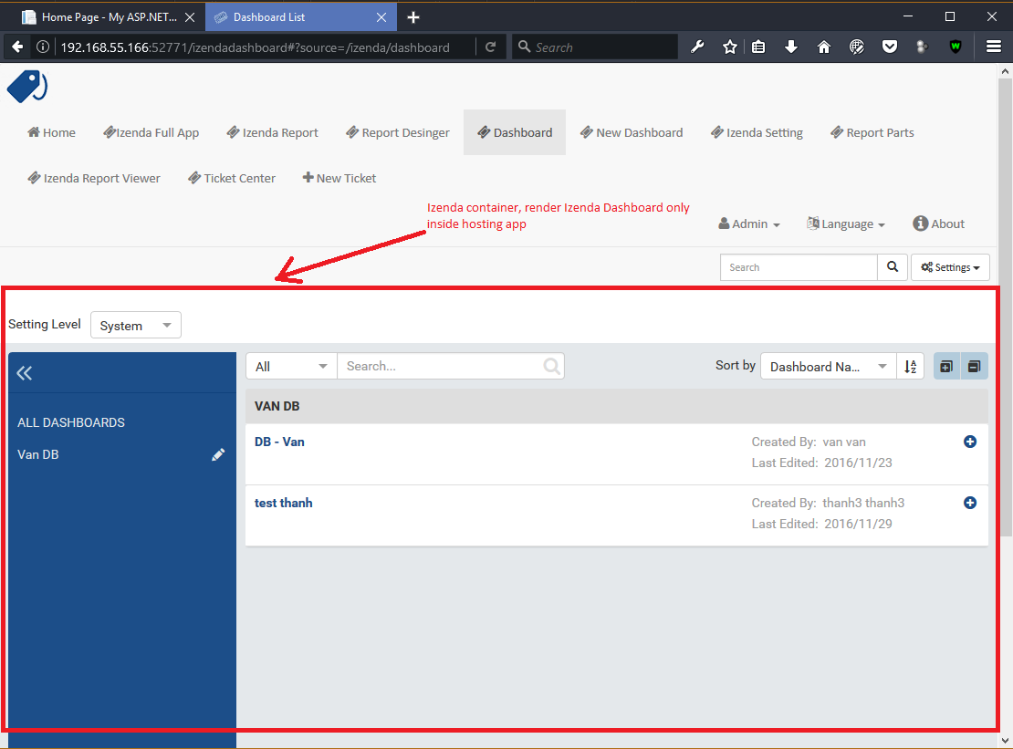
Fig. 428 Izenda Dashboard Only
renderNewDashboardPage(element)
Render Izenda New Dashboard page
Parameters
element
Samples
IzendaSynergy.renderNewDashboardPage(document.getElementById('izenda-root'));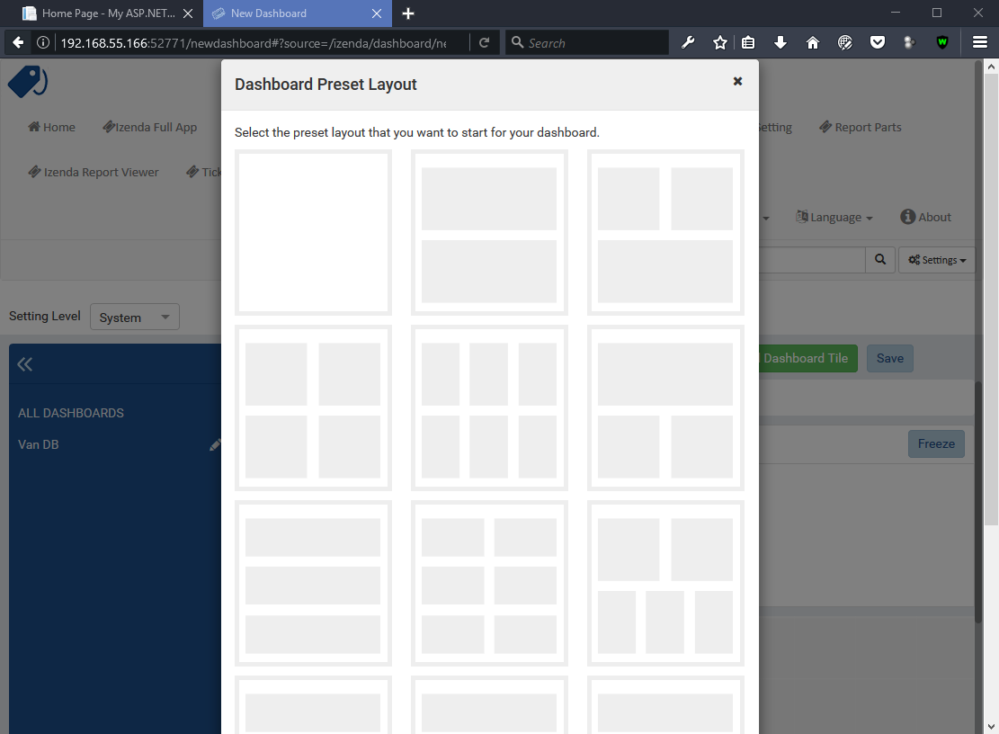
Fig. 429 Izenda Dashboard Designer Only
setCurrentUserContext({“token”:access_token}, keepPermissionSetting)
Authentication and authorization between hosting web and Izenda
Parameters
boolean
access_token
Samples
var currentUserContext = {
   token: data.token
};

IzendaSynergy.setCurrentUserContext(currentUserContext, true);
renderDashboardViewerPage(element, dashboard_id, filter, integrationStyle)
Render Izenda Dashboard Viewer page
Note
The integrationStyle parameter hideDashboardName was made available in v3.1.0.
Parameters
element The element to render in dashboard_id The id of the dashboard filter The values for the filters, in this format { p1: a_value, p2: another_value, .. }integrationStyle The options for toolbar and common filter section, in this format { hideDashboardToolbar: true/false, hideCommonFilter: true/false, hideDashboardName: true/false }
Samples
IzendaSynergy.renderDashboardViewerPage(
   document.getElementById('izenda-root'),
   '9371375f-2fe7-43f1-b83a-e69340f6136d',
   {
      p1: "10366",
      p2: "Barcelona"
   }, {
      hideDashboardToolbar: true,
      hideCommonFilter: false,
      hideDashboardName: false
   });
addJsFormat(formatName, formatFunction)
Register a JsFormatString with format function
This function is used in the LoadCustomDataFormat (see more here). To register this function, it must be declared in either your izenda.integrate.js (for embedded mode) or the index.html for (standalone mode). See example of both integrated and standalone below:
New in version 2.6.20.
Parameters
name The JsFormatString name that used in DataFormat formatFunction The js format function
Sample Integrated (izenda.integrate.js)
IzendaSynergy.config(configJson);
// Put the registration of JS format functions below. Please note: the format label is case sensitive.
IzendaSynergy.addJsFormat("1k", function (value)
   { return "$ " + value/1000 + " k"; }
);
Sample Standalone (index.html)
<script type="text/javascript" src="/izenda_ui.js?c76cbb3f0591ba2de5a0"></script>
<script>

   // Ensure this script is placed after Izenda UI library (izenda_ui.js as above)
   (function() {

      // Please note: the format label is case sensitive.
      IzendaSynergy.addJsFormat("1k", function (value) {
      return "$ " + value/1000 + " K"
         });
   })();
</script>
getClass(name)
Get the class by name. Following is the list of supported classes that can be retrieved via this API:
New in version 2.11.0.
| Class Name | Description |
|---|---|
| VizEngine | The base class of Izenda visualization engine |
| HighchartVizEngine | The visualization engine class of Highchart |
| HighmapVizEngine | The visualization engine class of Highmap |
| ChartOptionsBuilder | The base class of chart options builder. Extending ChartOptionsBuilder is to build a custom options builder for custom visualization engine. |
| HighchartOptionsBuilder | The base class of Highchart chart options builder |
| HighmapOptionsBuilder | The base class of Highmap map options builder |
| ReportPartContent | The base class of report part content model |
| ReportPartChartContent | The report part chart content model class |
| ReportPartGaugeContent | The report part gauge content model class |
| ReportPartMapContent | The report part map content model class |
| AreaChartOptionsBuilder | The Area chart options builder class |
| BarChartOptionsBuilder | The Bar chart options builder class |
| BubbleChartOptionsBuilder | The Bubble chart options builder class |
| ChartHasThresholdOptionBuilder | The base class of chart options builder that supports threshold settings |
| ColumnChartOptionsBuilder | The Column chart options builder class |
| CombinationChartOptionsBuilder | The Combination chart options builder class |
| DefaultChartOptionsBuilder | The default chart options builder. All chart options builders inherit from this class. It consists of the common logic to handle a chart options |
| DonutChartOptionsBuilder | The Donut chart options builder class |
| FunnelChartOptionsBuilder | The Funnel chart options builder class |
| HeatmapChartOptionsBuilder | The Heatmap chart options builder class |
| LineChartOptionsBuilder | The Line chart options builder class |
| PieChartOptionsBuilder | The Pie chart options builder class |
| The Pie chart options builder class | The Scatter chart options builder class |
| SparklineChartOptionsBuilder | The Sparkline chart options builder class |
| TreemapChartOptionsBuilder | The Treemap chart options builder class |
| WaterfallChartOptionsBuilder | The Waterfall chart options builder class |
| LinearGaugeOptionsBuilder | The Linear gauge options builder class |
| SimpleGaugeOptionsBuilder | The Simple gauge options builder class |
| SolidGaugeOptionsBuilder | The Solid gauge options builder class |
| ChartSettingsContainer | The ChartSettingsContainer React component. This component is used for building a custom popup content settings with supported configuration and preview panels. |
| FieldContainer | The minimal field container React component. This component is used for building a custom field container with supported common behaviours (add/remove/drag/drop) of fields. |
Parameters
- name: Name of class
Samples
Get VizEngine class
getClass('VizEngine');
registerVisualizationEngine(name, vizEngineClazz)
Register a visualization engine with a name
New in version 2.11.0.
VISUALIZATION_NAMES
Get the built-in visualization name constants
- Highchart: Name of Highchart visualization engine
- Highmap: Name of Highmap visualization engine
Parameters
name The name of visualization engine vizEngineClazz The class or constructor function of visualization engine. This class must inherit from VizEngine class.
Sample
class D3 extends VizEngine {
draw(chartContainer, chartType, options, onCompleted) {
   //Implement the drawing logic into chartContainer here.
   }
}

registerVisualizationEngine('D3', D3);
registerPropertyEditor(type, factory)
Register property editor with its factory function to create a custom property editor inside Report Designer’s property panel.
New in version 2.11.0.
Parameters
type Editor type key factory Function to create editor component
- Sample
Register a text input property editor
registerPropertyEditor('text', function(type, props) {
return {
   component: Input,
   props: {
      className: 'form-control',
      onChange: props.onChange
   }
};
});
Returns void
createDropDownPropertySchema
Create a dropdown editor schema in Properties editor panel. This function is used as the factory property value of propertySchema of report part/style configuration.
New in version 2.11.0.
Parameters
props: An object with the following properties.
props.title The title of label props.info The information tooltip of dropdown editor props.value The value of selected item of dropdown editor props.props The component properties props.isHidden Hide the editor or not.
(It is optional with the default value is false)
Sample
An example of how using the function to create a dropdown list field schema in report part property schema
{
   factory: createDropDownSchema,
   title: 'Example Dropdown',
   value: 'getChartType',
   props: {
      defaultValue: 'value1',
      options: ['value1', 'value2']
   }
}
createPopupSettingPropertySchema
Create a popup editor schema in Properties editor panel. It appears as a label and a gear button which opens the popup dialog. This function is used as the factory property value of propertySchema of report part/style configuration.
New in version 2.11.0.
Parameters
props: An object with the following properties.
props.title The title of label props.info The information tooltip of editor props.value The value of selected item of editor props.props The component computational properties props.staticProps The component’s static properties props.isHidden Hide the editor or not.
(It is optional with the default value is false)
Sample
{
   factory: createPopupSettingSchema,
   title: 'Border',
   value: 'getBorder',
   props: {
      reportPartType: REPORT_PART_TYPE.Chart,
      title: 'Border Settings',
      // The Border settings dialog uses chart properties to render the preview
      allChartProps: 'getAllChartProps',
      // Getter function or property to determine whether the setting exists
      hadSetting: 'hadSettingBorder',
      // Function to reset the setting value
      fnResetDefaultValue: 'fnResetBorderDefaultValue',
      // Getter function to retrieve value
      loadValue: 'getBorder'
   },
   staticProps: {
      popupTitle: 'Border Settings',
      popupContent: ChartBorderSettings
   }
}
createCheckBoxPropertySchema
Create a checkbox editor schema in Properties editor panel. It appears as a label and a checkbox. This function is used as the factory property value of propertySchema of report part/style configuration.
New in version 2.11.0.
Parameters
props: An object with the following properties.
props.title The title of label props.info The information tooltip of editor props.value The value of selected item of editor props.isHidden Hide the editor or not.
(It is optional with the default value is false)
Sample
izSeparator: {
   factory: createCheckBoxSchema,
   title: 'Use Separator',
   // 'getValueByKey' is a default getter function of Chart that allows to get the value of a property of chart properties by its field name, ie. izSeparator
   value: 'getValueByKey'
}
createSelectPropertySchema
Create a select editor schema in Properties editor panel. It appears as a label and select control. This function is used as the factory property value of propertySchema of report part/style configuration.
New in version 2.11.0.
Parameters
props: An object with the following properties.
props.title The title of label props.info The information tooltip of editor props.value The value of selected item of editor props.props The component computational properties props.staticProps The component’s static properties props.isHidden Hide the editor or not.
(It is optional with the default value is false)
Sample
Create a selection list of state with default blank option is All
{
   factory: createSelectSchema,
   title: 'State',
   value: 'getValueByKey',
   props: {
      options: 'getStateByCountry'
   },
   staticProps: {
      blankOption: true,
      blankOptionText: 'All'
   }
}
createNumberPropertySchema
Create a number editor schema in Properties editor panel. It appears as a label and number input control. This function is used as the factory property value of propertySchema of report part/style configuration.
New in version 2.11.0.
Parameters
props: An object with the following properties.
props.title The title of label props.info The information tooltip editor props.value The value of selected item editor props.props The component properties props.isHidden Hide the editor or not.
(It is optional with the default value is false)
Sample
{
   factory: createNumberSchema,
   title: 'Item Per Row',
   value: 'getValueByKey',
   props: {
      min: 1,
      max: 20,
      isDecimal: false
   }
}
createColorPaletteSettingPropertySchema
Create a color palette editor schema in Properties editor panel. It appears as a label and color palette input control. This function is used as the factory property value of propertySchema of report part/style configuration.
New in version 2.11.0.
Parameters
props: An object with the following properties.
props.title The title of label props.info The information tooltip editor props.value The value of selected item editor props.props The component properties props.isHidden Hide the editor or not.
(It is optional with the default value is false)
Sample
{
   factory: createColorPaletteSettingSchema,
   title: 'Color Theme',
   value: 'getColorTheme',
   props: {
      selectionPopupTitle:'Select Color Theme',
      defaultColorThemeLabel:'No Theme',
      displaySettingStatus: true,
      needMaskDefault: false,
      defaultColorPalette: null,
      hiddenByState: true
   }
}
registerFieldContainer
Register field container with its factory function in order to create a custom field container in Report Designer’s report part configuration. Most of the time, using createFieldContainerSchema function to create labeled box of fields fits in the same way with current Values, Labels… field containers.|br|
New in version 2.11.0.
Parameters
type Field container type, i.e. chart_label, grid_rows… factory Function to create field container
Sample
Create an custom metric fields container using CustomMetricReactComponent
// Note that it requires to create a React component to render the custom metric GUI
registerFieldContainer('custom_metric', function(type, containerProps) {
   return {
      key: type,
      component: CustomMetricReactComponent,
      props: containerProps
   };
});
Returns void
createFieldContainerSchema
Create a label and a field input box which allows to add/remove or drag/drop a field into.
New in version 2.11.0.
Parameters
containerKey An unique container key to identify the container label The label text value or a function returning a text dataKey Data key to access container information of report part content’s property height Pixel height of container. Leave it null or undefined to use default height maximumField Maximum number of fields in the container. Leave it null or undefined to unlimit the number of fields isHorizontal Whether horizontal alignment between label and input box or not
(It is optional with the default value is false)
Sample
Create Z-Axis Values field container with dataKey is ZValues, having default height and 1 field maximum
createFieldContainerSchema('ZValues', 'Z-Axis Values', 'ZValues', null, 1);
createStaticLabelFieldContainerSchema
Create a static label only without input box.
New in version 2.11.0.
Parameters
type Field container type, i.e. chart_label, grid_rows… label The label text value or a function return a text
Sample
createStaticLabelSchema('LabelPoint', function() {
return localizer.getText('LABEL_POINT_OPTIONS');
})
createConditionalFieldContainerSchema
Create a conditional label and a input box of fields which allows to add/remove or drag/drop a field into.
New in version 2.11.0.
Parameters
predicateFn A predicate to determine whether render the container or not. It receives report part detail object as a parameter. containerKey The key of the container label The label text value or a function return a text dataKey Data key to access container information of report part content’s property height Pixel height of container. Leave it null or undefined to use default height maximumField Maximum number of fields in the container. Leave it null or undefined to unlimit the number of fields isHorizontal Whether horizontal alignment between label and input box or not
(It is optional with the default value is false)
Sample
Create an example container with dataKey is exampleContainer, having default height and 1 field maximum
createConditionalContainerSchema(
   function(reportPartDetail) {
      return true;
   },
   'exampleContainer',
   function() {
      return localizer.getText('ExampleContainer');
   },
   'exampleContainer',
   null,
   1,
   true
);
setReportPartConfiguration
Set configuration of a report part type. It is typically using for customizing the existing report part type (i.e. Chart, Gauge or Map). Instead of setting a new configuration, it recommends getting the current configuration via :doc: getReportPartConfiguration, change appropreate property, then set it back using this function. By changing this configuration, it would impact to all report part styles of the particular report part type. For example, adding a new field container schema to the Chart configuration will result the new field container appears in all chart type configuration designer.|br|
New in version 2.11.0.
Parameters
reportPartType Report part type configuration A report part type configuration object with the following properties:
- configuration.visualEngine
The name of default visualization engine. It will be used as default visualization engine if the report part style configuration doesn’t specify explicitly- configuration.optionsBuilder
The options builder class or constructor function to build visualization options- configuration.model
The report part content model class or constructor function. This class/constructor is used to construct ReportPartContent object- configuration.fieldContainerSchema
An array of field container schema- configuration.propertyWidgets
An array of custom React components to create property editor.It would be useful in case of using a custom React component directly in the propertySchema property, instead of using registerPropertyEditor to register a custom property editor by type.- configuration.propertySchema
The object contains defined schema of property editor of report part in designer- configuration.propertyMappingProps
The function to create the mapping properties object- configuration.propertyMappingSource
The function to create the mapping source object- configuration.propertyValueChange
The function to create value change handler- configuration.optionsMapping
Mapping to visualization options. This settings is optional as you can write code in options builder to populate visualization object
Sample
setReportPartConfiguration(REPORT_PART_TYPES.Chart, {
visualEngine: 'Highchart',
// The builder class to build chart visualization options
optionsBuilder: CustomHighchartOptionBuilder,
// Report part content model class
model: CustomReportPartChartContent,
// Default field container schema
fieldContainerSchema: null,
// Array of custom React component to create property editor.
// It would be useful in case of using a custom React component directly in the propertySchema property, instead of
// using registerPropertyEditor to register a custom property editor by type.
propertyWidgets: [],
// The object contains defined schema of property editor of report part in designer
propertySchema: {
   schemaKey: 'Example',
   groups: {
      example_group_name: {
      title: 'Example Group',
      fields: {
         example_field_name: {
            factory: createDropDownSchema,
            title: 'Title of example_field_name',
            value: '<any property name or getter function of propertyMappingProps, propertyMappingSource object>',
            props: {
            defaultValue: 'value1',
            options: ['value1', 'value2']
            }
         }
      }
      }
   }
},
// The function to create the mapping properties
propertyMappingProps: function(reportPartDetails, fieldStore) {
   return {
      otherProperty: 'Value1'
   };
},
// The function to create the mapping source
propertyMappingSource: function(reportPartDetails, fieldStore) {
   return {
      example_field_name: 'Value1'
   };
},
// The function to create an value changed handler
propertyValueChange: function(reportPartDetails, fieldStore) {
   return function(schemaData, changedKey, changedKeyPath, changedValue, changedOthersInfo, derivedChange) {
      // It must return a Promise with chartProperties object.
      return Promise.resolve({ needToUpdate: false, chartProperties: reportPartProperties });
   };
},
// Mapping to visualization options.
// This settings is optional as you can write code in options builder to populate visualization object
optionsMapping: null
});
getReportPartConfiguration
Get configuration of a report part type.|br|
New in version 2.11.0.
Parameters
- reportPartType: Report part type
Sample
Gets the report part configuration object of Chart
getReportPartConfiguration(REPORT_PART_TYPES.Chart);Returns [Object][14]
extendReportPartStyleConfiguration
Extends report part with a new style configuration.
New in version 2.11.0.
Parameters
reportPartType Report part type reportPartStyle The new report part style baseStyle A chart type that new chart derives on configuration The new chart type configuration with the following properties
- configuration.visualEngine
The name of visualization engine.x
This settings is optional.The default visualization engine which is defined in report part configuration.- configuration.visualType
Visual type to identify which visualization type to be rendered. For example, it would be “type” property of Highchart options.- configuration.visualLabel
The label text of this report part style showing in the chart type dropdown of report designer.- configuration.optionsBuilder
The options builder class or constructor function to build visualization options.- configuration.fieldContainerSchema
An array of field container schema.
This settings is optional.- configuration.propertyWidgets
An array of custom React components to create property editor.
It would be useful in case of using a custom React component directly in the propertySchema property, instead of using registerPropertyEditor(type, factory) to register a custom property editor by type.- configuration.propertySchema
The object contains defined schema of property editor of report part in designer- configuration.propertyMappingProps
The function to create the mapping properties object- configuration.propertyMappingSource
The function to create the mapping source object- configuration.propertyValueChange
The function to create value change handler- configuration.optionsMapping
Mapping to visualization options.
This settings is optional.
Sample
Extend Chart with an additional 3D Column chart type
extendReportPartStyleConfiguration(REPORT_PART_TYPES.Chart, '3DColumn', CHART_STYLES.Column, {
visualType: 'column',
visualLabel: '3D Column',
propertySchema: {
   groups: {
      chart: {
      fields: {
         '3d': {
            factory: createCheckBoxSchema,
            title: 'Enable 3D',
            value: 'getValueByKey',
            props: {
            title: 'Enable 3D'
            }
         }
      }
      }
   }
},
propertyValueChange: (reportPartDetails, fieldStore) => (
   chartProperties,
   schemaData,
   changedKey,
   changedKeyPath,
   changedValue,
   changedOthersInfo
) => {
   const threeDOptions = schemaData.chart['3d'];
   chartProperties.optionByType['3d'] = threeDOptions ? threeDOptions.value : false;
},
optionsBuilder: ThreeDColumnChartOptionsBuilder,
optionsMapping: {
   optionsByType: {
      '3d': { propKey: 'chart.options3d.enabled', defaultValue: true }
   }
}
});
renderExportManagerPage(element)
Render Izenda Export Manager Page inside hosting web
Parameters
element
Samples
IzendaSynergy.renderExportManagerPage(document.getElementById('izenda-root'));
Tags
Embed, Embedding, Fully Embeddable.