Internet Explorer hits the mark for web engagement with The Hunger Games Explorer.
The film adaptation of Catching Fire, the second in the Hunger Games trilogy, doesn’t come out until November. But Internet Explorer partnered with the Games web team and RED Interactive Agency to give fans an edgy, interactive online portal that gives them everything they need to whet their appetite while they wait.
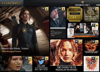 The team built this site on some of the very latest web technologies, and it’s especially designed for the touch-screen, tablet experience. There’s all the regular stuff, like trailers and exclusive photos, but there is also content to keep users coming back. Fans can sign up and get their own District ID, and go behind the scenes on the making of the film via this futuristic online content portal.
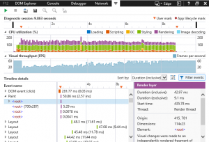
The team took special pains to ensure the technology lives up to the demand for excellent user experience. This comes across in the responsive grid layout designed to be just as engaging no matter whether the user is on a mobile phone or tablet. “Taking a mobile-first approach [to back-end design] allowed us to ensure we used a single code base across multiple platforms and devices,” the behind-the-scenes website reveals. The grid was built using JavaScript.
Read More
 Remember when websites used to have a header that read “Best Viewed in Internet Explorer?” It seems that as that trend has faded, so too will Internet Explorer (IE). With the release of Microsoft Edge, a Windows 10 only browser, Microsoft has announced that support for older versions of IE will be ending. What are the details, and what does this mean for people who have applications developed specifically to older versions of IE? Read More