Counter-intuitive? Yes
Charts are supposed to make it easier for us to understand data. But poorly-made charts can be worse than no chart at all.
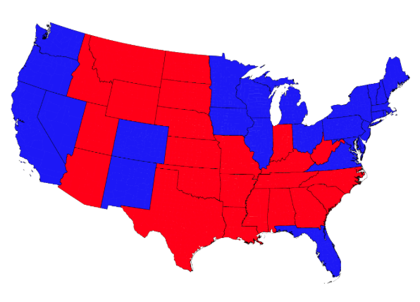
It’s easy to see the way 3D graphics and charts can distort information, allowing you to use — either by mistake or on purpose — data to tell any story you want. Yes, it is easy to misuse data, and it often happens by accident. It happens most often because we are trying to build visualizations that are not ideal for the type of information being shared, whether its tracking market share over time across competitors, or representing the United States’ voting habits by showing a map with different colored states (which misrepresents population size as it relates to state size). We’ve all seen this and been confused by the numbers it represents:
Source: Fast Company
But how about something that doesn’t so obviously seem off? Consider the green chunk of the pie pictured in the graphic below. It’s representing the same percentage in both charts, but because of the 3D depiction, what our eyes see is deceptive — it’s a misrepresentation of the data.

Source: Fast Company
And stacked area charts, which are the sexy darling of publications and news sources, are some of the worst offenders. It is simply hard for people to view one of these renderings and manage to come to the right conclusion based on the data that it is based on. These two charts are based on the same data, but present vastly different pictures:
 Source:flickr |
 Source:flickr |
Now we can see what is actually happening with these three companies, whose market shares are compared in both these charts, using the exact same data. We see that Green Company’s market share actually grew, rather than shrink, which is how it appears to the eye in the chart on the left. (That’s because the chart plots the market value vertically, while the human eye perceives the thickness and general direction of the colors.)
The Remedy
Data scientist Gregor Aisch sees a logical solution for the potential troubles that can befall our data visualizations: build visualization best practices into your software and tools, as you are creating them. Solve the problems for the users before they even have to ponder whether or not to use a pie chart to represent annual growth on their company over time (hint: they should not).
When we develop strong, sound systems for business intelligence systems, we are ensuring from the start that people will be able to build better reports as a result. There is no need for every single professional to have to understand lofty concepts in statistics, or best practices in chart-making. There’s already enough to think about in your report, without wondering if the chart you’ve selected presents the data the most logical way. That’s the job of the developers and data scientists behind great business intelligence platforms.
Have you made or reviewed any faulty charts recently? Tell us your thoughts.