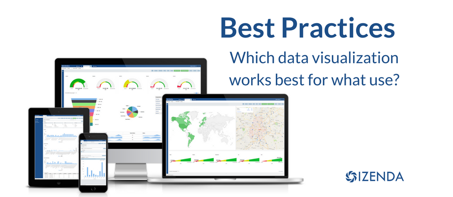

Looking at visualizations makes the data clear and compelling to the user, and many times easier to understand than a bunch of numbers. Depending on the data you are looking for, you will want to use a different visualization to accurately portray that data. Read More
We often get asked how many different types of charts we support. While there are about a hundred variations we support out of the box, our underlying Dundas API can generate pretty much any chart style or type imaginable. If you’d like us to create a custom chart for you, just send us a picture of what it should look like.
Supporting additional chart types involves adding UI elements to the chart tab and applying the behavior via the CustomizeChart() method. In this article we will add an average line to our plot chart.
(This is part of a series of posts on the new Izenda Reports 6.4, presently at the Release Candidate stage.)
Add a bit of flair to your gauges with the new color palette selection options that lets you specify multiple colors and one of four kinds of gradient. Enable it by filling in the “Color” text box in the Gauges tab. Read More
![]()
Copyright 2021 Izenda, Inc. | Privacy Policy | Sitemap